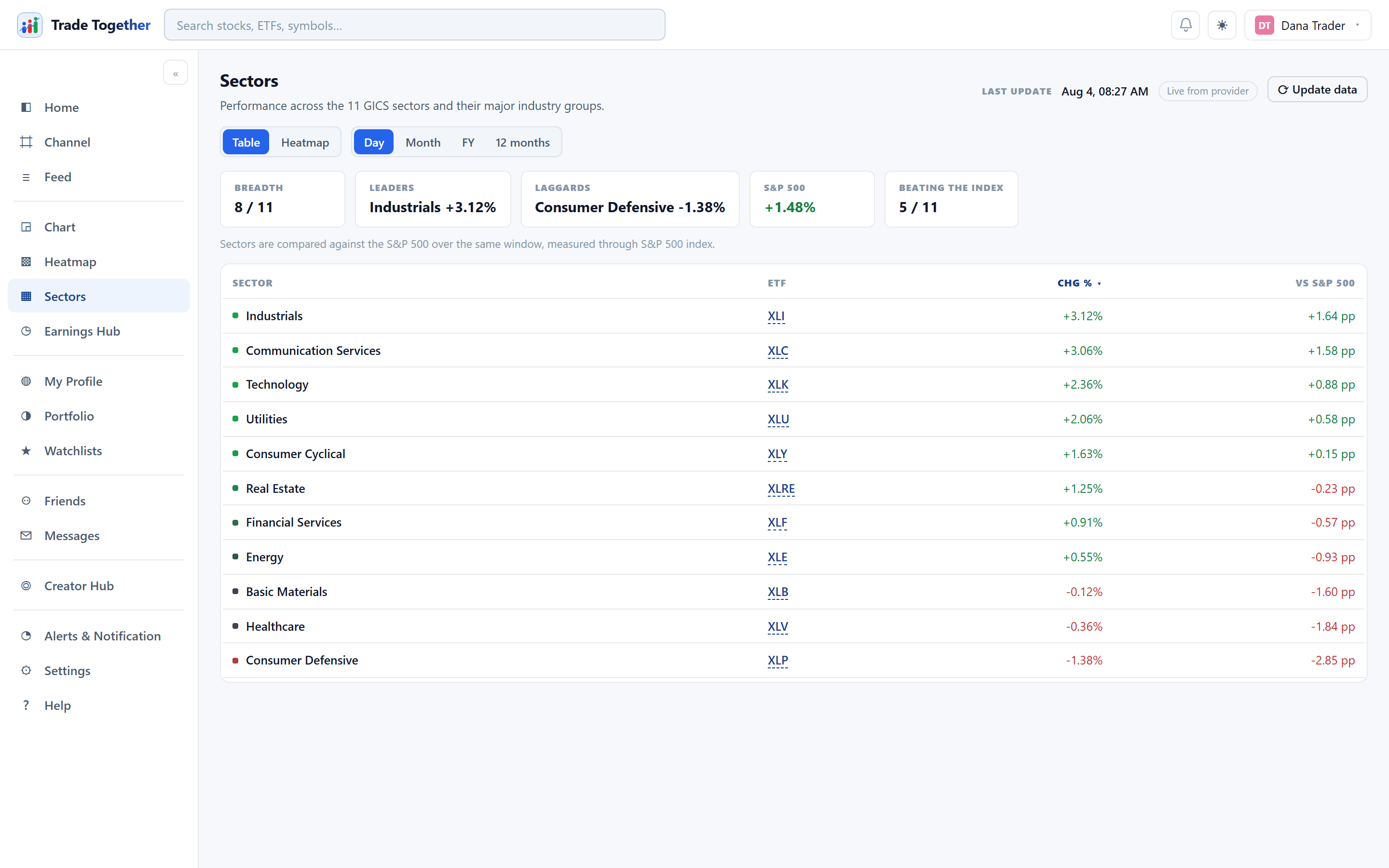
How the eleven GICS sectors are performing, each with the ETF that tracks it. Two controls at the top, and they are independent:
- Table / Heatmap
- The same data, drawn two ways. The table sorts by any column — click a header.
- Day · Month · FY · 12 months
- The window being measured. It applies to both views, so switching from table to heatmap keeps the period you chose.
Click any sector to drill into it. There is also an ⟳ Update data button, as on the heatmap.
The first time you pick a longer window it takes a moment — the app has to fetch the session at the start of that window, and the data provider allows only five requests a minute. It is cached afterwards, so it is slow once and instant after that.
Where a sector figure had to be built up from its constituents rather than read from a proper sector endpoint, the page says so underneath. That note is not decoration — an approximated figure and a reported one deserve different amounts of trust.
The eleven, and what tracks them. Each row is a GICS sector measured through the exchange-traded fund that follows it: Technology (XLK), Financial Services (XLF), Health Care (XLV), Consumer Cyclical (XLY), Consumer Defensive (XLP), Energy (XLE), Industrials (XLI), Basic Materials (XLB), Utilities (XLU), Real Estate (XLRE) and Communication Services (XLC). Any of them can be opened as a chart like any other symbol.
Read the benchmark column, not the return. “Technology +1.4%” is half a fact. Whether that is strength or weakness depends entirely on what the market did — and on most days every sector moves the same direction as the index, so eleven green rows tell you nothing about which sector actually did something. The page therefore shows each sector against the S&P 500 over the same window. A sector up 1.4% on a day the market rose 2% was the weakest place to have been.