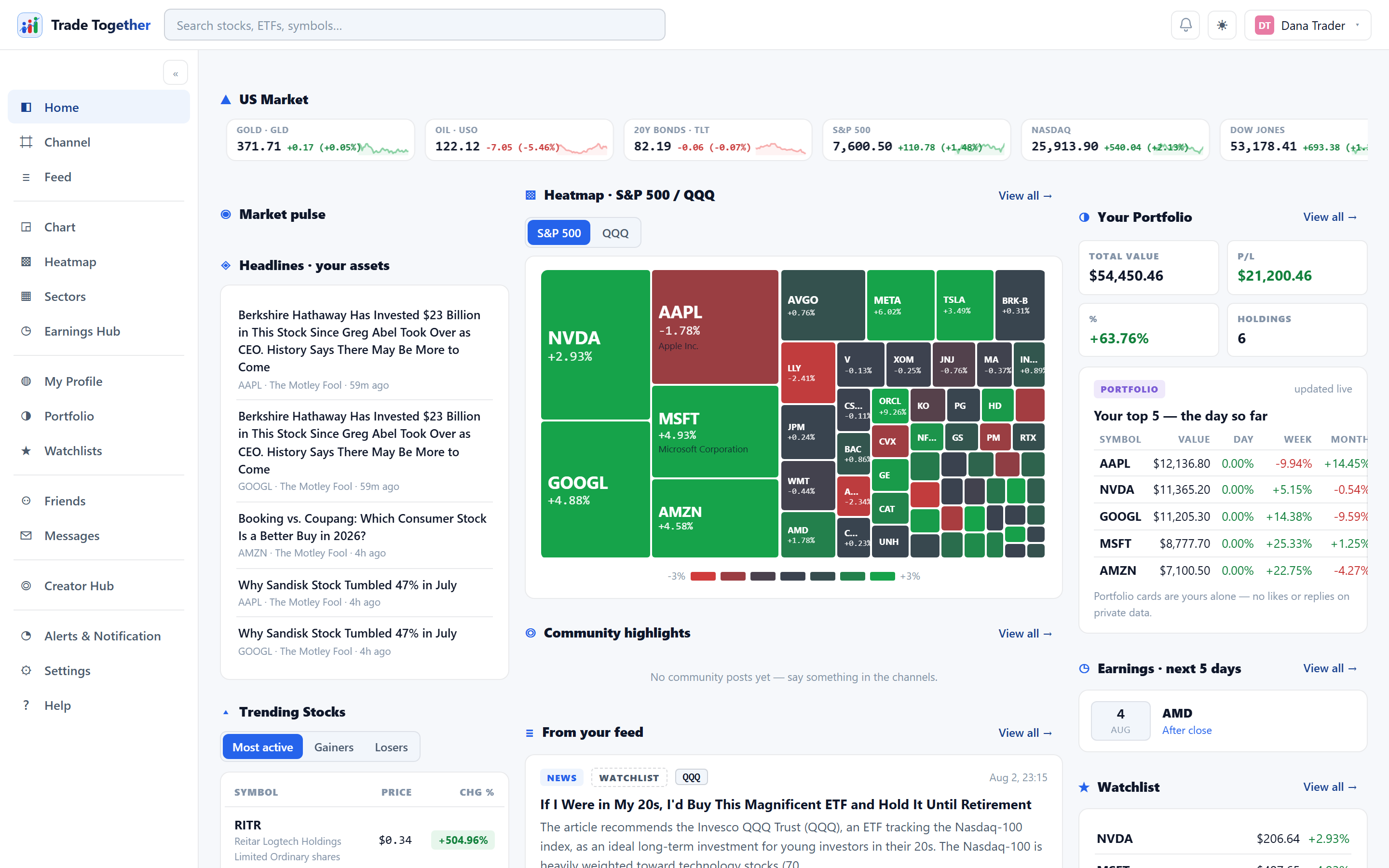
Home is a dashboard of previews. Nothing on it is unique to the page — every card is a summary of a fuller page, and each has a View all → to get there. It is designed to be the first thing you look at, not somewhere you spend time.
Across the top, a continuously scrolling strip shows the four major indices followed by five macro ETFs — small caps (IWM), semiconductors (SOXX), gold (GLD), oil (USO) and long-dated treasuries (TLT). It pauses when you hover over it so you can actually read a number, and every entry opens its chart.
Below that, three columns:
- Left — the market
- Market pulse says whether the day is bullish, mixed or bearish, with the share of US stocks advancing and the current session (pre-market, open, after hours, overnight, or weekend). Headlines and Trending follow, then a small sector table.
- Middle — the community
- A miniature index heatmap, Community highlights (recent channel posts) and From your feed.
- Right — you
- Your portfolio summary, Earnings · next 5 days filtered to companies you actually hold or watch, headlines for your assets, and your watchlist.
The right-hand column is empty until you own or watch something. That is not a fault — add a holding or a watchlist symbol and these cards build themselves around it.
On a narrow screen the three columns become one, in the same order: the market, then the community, then you. On a wide one the right-hand column stays put while the middle scrolls, so your holdings and the next earnings dates remain visible while you read down the page.