- S&P 500 and Nasdaq-100 as living treemaps — tile size is market cap, tile colour is today’s move.
- Every tile is a jump-off — go from a mover straight to its chart, its financials, or the people trading it.
- Free, and no account needed to read this — the live map is inside the free app. No card, no tier, no trial clock.
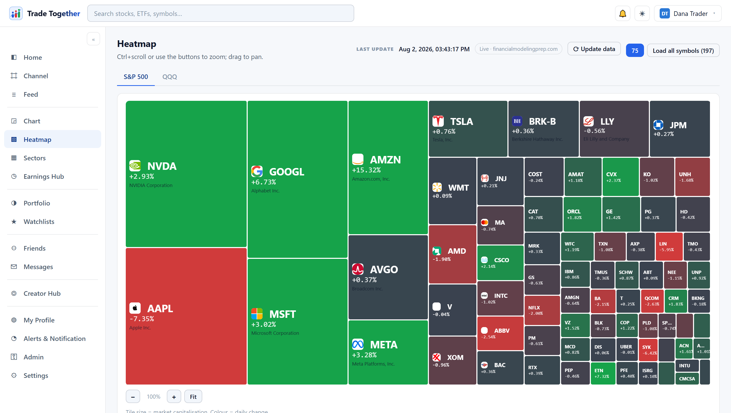
What is a stock heatmap?
A stock heatmap is a single image of a market where every company is a coloured rectangle, or tile. Tile size shows how big the company is by market value, and the colour shows how its share price moved today — green for a gain, red for a loss.
Under the hood it's two well-known chart types stacked together. A heat map is "a two-dimensional data visualization technique that represents the magnitude of individual values within a dataset as a color." A treemap displays data "as a set of nested rectangles" where each tile's "area proportional to a specified dimension of the data" and the tiles are "colored to show a separate dimension." Put those together for the stock market and you get size = company, colour = today's move. Nothing more complicated than that.
How do you read a stock market heatmap?
Read colour first, then size, then position. Colour tells you the percentage price move today, tile size tells you the company's market cap, and the tiles are grouped into sector blocks so you can tell whether a move is one lonely stock or a whole industry going the same way.
Here's the three-second scan in practice. Glance at the overall wash of colour — mostly green means a broadly up day, a sea of red means a down one, a patchwork means it's mixed. Then look at the big tiles, because a huge company turning red drags the market far more than a tiny one. Finally, check the sector blocks: if all the energy names are green but everything else is red, that's rotation into one corner of the market, not a rally. You've read the day before you've opened a single chart.
The point of the layout is speed. A heatmap isn't there to give you a precise number — it's there to show you where to look next. Spot the outlier, then dig in.
What do the colours and tile sizes actually mean?
Colour has two jobs at once: hue is direction, intensity is magnitude. A deep, saturated green means the stock is up hard today; a pale green means it barely moved; grey or near-white means roughly flat — and red works the same way in the other direction. Tile size is market capitalisation, so the largest tiles are the mega-caps and they physically dominate the screen.
That size rule is why the same handful of names anchor almost every US heatmap. The Magnificent Seven — "Alphabet (parent company of Google), Amazon, Apple, Meta Platforms, Microsoft, Nvidia, and Tesla" — are so large that their tiles swallow the top of the map. When one of them is deep red on a green day, that's worth a second look, because a giant tile moving even a little represents a lot of the market's value.
Here's every part of a stock heatmap in one place.
| Element | What it means |
|---|---|
| Tile size | The company's market cap. Bigger tile = bigger company. Mega-caps dominate the view. |
| Tile colour (hue) | Direction of today's price move. Green = up, red = down, grey ≈ flat. |
| Colour intensity | Magnitude of the move. Deep shade = a big percentage move; pale shade = a small one. |
| Grouping / sector blocks | Tiles are clustered by sector, so you can see whether a move is one stock or the whole industry. |
| Hover / detail | Hovering a tile reveals the exact ticker, price and percentage change behind the colour. |
Not investment advice — the colours describe what already happened today, not what happens next.
What's the difference between an S&P 500 heatmap and a Nasdaq (QQQ) heatmap?
An S&P 500 heatmap shows roughly 500 large US companies across every sector, so it reads like the broad market. A Nasdaq-100 (QQQ) heatmap shows 100 of the biggest non-financial companies on the Nasdaq, so it leans hard into tech and leaves the banks out.
The difference comes straight from how each index is built. The S&P 500 is "a stock market index tracking the stock performance of 500 leading companies listed on stock exchanges in the United States," spanning financials, healthcare, energy, industrials — everything. The Nasdaq-100 is built from "100 of the most innovative large cap companies listed on the Nasdaq Stock Market," and it deliberately excludes financials. QQQ is the popular ETF that tracks that Nasdaq-100 index, which is why people say "the QQQ heatmap."
In practice: use the S&P 500 map when you want the mood of the whole US market, and the Nasdaq-100 map when you care most about big tech and growth names. On a day when tech leads and banks lag, the two maps can look like completely different weather.
Is there a free, live stock heatmap?
Yes. Trade Together's stock heatmap is free and live, and it sits right inside the dashboard — no tiers, no paywall, no credit card. It shows both the S&P 500 and the Nasdaq-100 (QQQ) as living treemaps: tile size is market cap, tile colour is today's move, updating through the trading day.
What makes ours a little different is what happens after you spot a mover. See a big tile flip red? On Trade Together you can jump from that tile to the community and see who's actually trading it — creators who open their portfolios and results, and other retail traders talking through the same name in real time. A community, not just a terminal.
Two honest caveats, because we don't do hype. Trading on Trade Together is simulated — it's for learning and practice, not real-money brokerage execution, and we're not a broker. And none of it is investment advice; a heatmap tells you what moved, not what you should do about it. Everything here is free, for everyone.
How is a heatmap different from a stock screener?
A heatmap shows you the whole market at a glance so you can see where things are moving. A stock screener does the opposite — it filters the market down to a shortlist that matches rules you set, like a price range, a sector, or a valuation limit.
Think of them as two ends of the same workflow. The heatmap is discovery: you didn't know what you were looking for, and the colour and size point you at the outliers. The screener is refinement: you already know your criteria, and you want the market narrowed to the names that fit. Most people use both — spot something odd on the map, then screen for others like it, then open the chart, financials, earnings and news to understand why.
That's the loop Trade Together is built around. The heatmap, the charts, the financials, the earnings, the news and the community all live in one free place, so you can go from "huh, that's moving" to "here's what's going on and here's who's trading it" without leaving the dashboard. Trade with people, not just with charts.
Not investment advice. Do your own research, and remember the practice here is simulated.
Two decisions here that most heatmaps do not tell you about. The boards are hand-picked large caps rather than a live index-membership feed — constituents change, and a map that silently drifts out of date is worse than one that admits its list is curated. And the board is shared, not per-person: the first visitor to open it pulls the data and everyone else reads that same capture, which is why the page prints a timestamp and says whether you are looking at a shared board or a live pull. There is an ↻ Update data button for when you want a fresh one.
We built it that way because market data is metered. One person opening the heatmap should not spend the whole community’s daily allowance — and if we are going to serve you a capture that is a few minutes old, the honest thing is to put its age on the screen rather than imply it is live.
We have no testimonials. The platform is new and we are not going to invent any. What we have instead is the thing testimonials are a proxy for: every position opened through the app is priced and timestamped by us and written to a log that cannot be edited or deleted by anyone, including an administrator. Losses stay in. A member’s own typed-in history is kept separate, labelled, and counts towards nothing anyone else sees.
Free, no credit card, no tier. Trading here is simulated, and none of this is investment advice.