- The full price history, with volume underneath and the timeframe yours to set.
- Five moving averages plus one you define, with RSI, MACD and Bollinger bands on the same view.
- Earnings and dividends marked on the price itself, and financials and technicals one tab away.
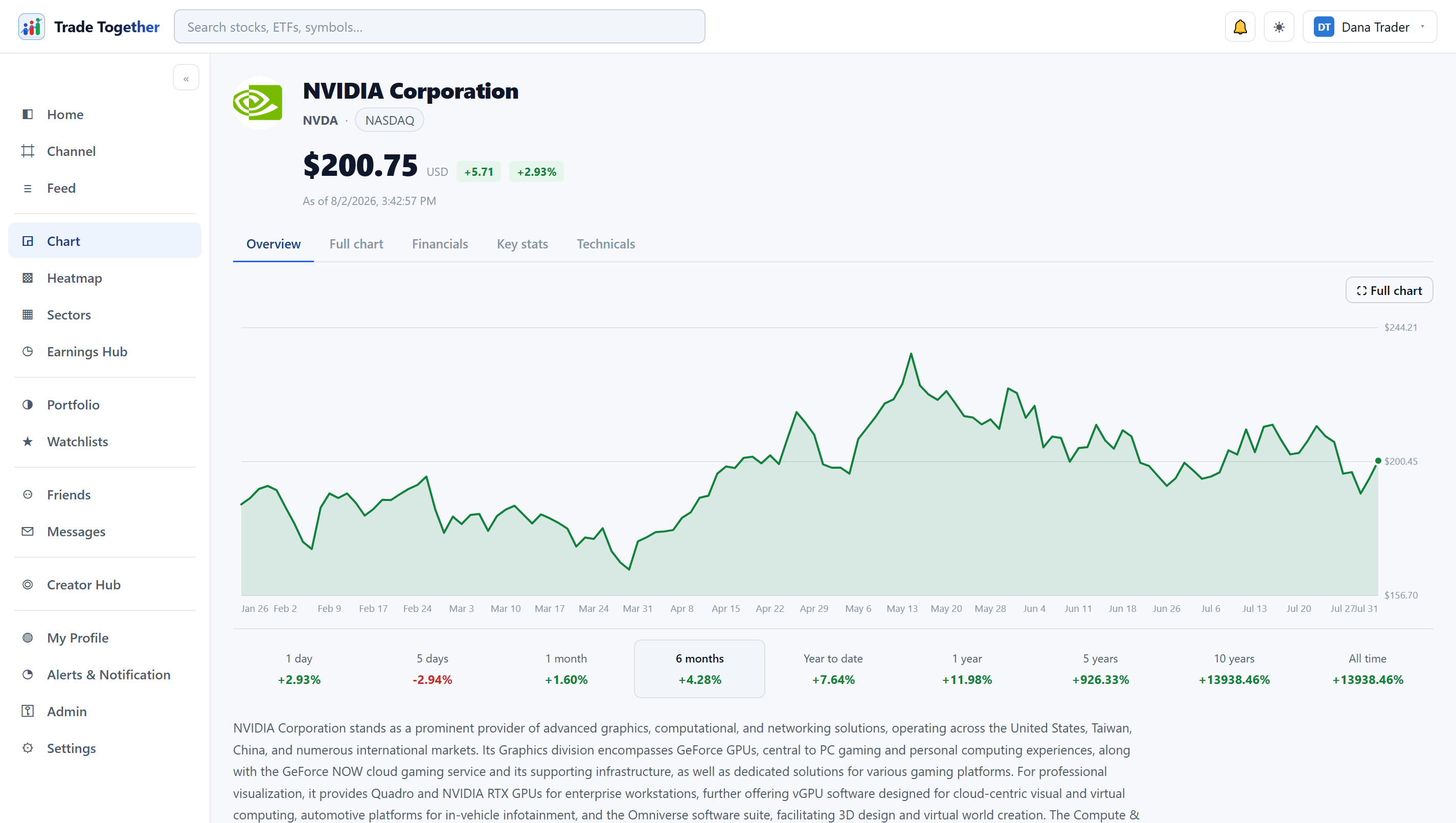
What are stock charts?
A stock chart is a visual record of a stock's price over time, usually with trading volume shown underneath. It plots what buyers and sellers agreed on, moment by moment, so you can see trend, momentum and turning points at a glance.
Time runs along the bottom, price up the side, and volume — the number of shares traded — sits in bars below. That's the whole grammar of it. Zoom in and you're looking at today. Zoom out and you're looking at years. On Trade Together you can pull the view all the way back to a stock's full price history, which matters more than it sounds: a stock that looks expensive this month can look like a bargain against a decade. A chart shows you the past, not the future — it's a map, not a forecast. Not investment advice.
How do you read a stock chart?
You read a stock chart from two things at once: price and volume, across a timeframe you choose. Price tells you where the stock traded; volume tells you how many shares changed hands, which is a rough gauge of how much conviction was behind the move.
The timeframe is yours to set — one minute, one day, one week per data point — and the same stock tells a different story on each. Most charts use candlesticks, and once you can read one candle you can read the whole chart. Each candle covers a single period. According to StockCharts' guide to candlesticks, a candlestick is built from four prices — the open, high, low and close — where "the hollow or filled portion of the candlestick is called 'the body'" and "the long thin lines above and below the body represent the high/low range and are called 'shadows' (also referred to as 'wicks')." So the body is the distance between open and close; the wicks reach up to the high and down to the low. A tall body means the price moved a lot between open and close. Long wicks mean the price travelled and then got pushed back. Colour tells you direction — up or down for the period. That's it.
Volume is the second half of the read. A big move on heavy volume means a lot of people agreed on it; the same move on thin volume is easier to fade. You don't need to memorise patterns to start — read the body, glance at the wicks, check whether volume backs the move, and you already know more than someone staring at a single number. Not investment advice, just the anatomy.
What are the main types of stock charts?
The three main types of stock charts are the line chart, the bar (OHLC) chart, and the candlestick chart. Each plots the same price data at a different level of detail — a line shows only the closing price, while a bar or candle shows the open, high, low and close for every period.
Which one you use depends on what you want to see. Britannica Money's guide to chart types notes that line charts "may be helpful when you're looking for a high-level glance at a market or want to see the general trend," while candlestick charts "show the open, high, low, and close just like bar charts" — the difference being the shaded real body between the open and close. Here's how the three compare:
| Chart type | What it shows | Best for |
|---|---|---|
| Line | Closing price only, connected into one line | A quick, clean read on the overall trend |
| Bar (OHLC) | Open, high, low and close as a single vertical bar | Seeing the full range without colour coding |
| Candlestick | Open, high, low and close as a coloured body plus wicks | Reading momentum and who won each period |
Beginners usually start on the line chart and graduate to candlesticks. There's no "best" one — a line is honest about the trend, a candle is honest about the fight. Pick the one that answers your question.
What are moving averages, and how do you use them on a chart?
A moving average smooths price data into a single line so you can see the trend without the day-to-day noise. You use it to gauge direction — price above a rising average leans bullish, price below a falling one leans bearish — and to watch the points where a shorter and a longer average cross.
There are two common kinds. StockCharts explains that "moving averages smooth the price data to form a trend-following indicator," where simple moving averages (SMAs) average prices evenly over the window while exponential moving averages (EMAs) "give more weight to recent prices." Both lag — they're built from past prices, so they confirm a move rather than predict it. Common lengths are the 50-day and 200-day; when the shorter one crosses above the longer one it's often called a "golden cross," and the reverse a "death cross" — dramatic names for two lines meeting. On Trade Together you can plot five moving averages at once, plus a custom one you define yourself — so you can stack a fast EMA against a slow SMA on the same chart and see where they part ways. Moving averages are a lens, not a crystal ball. Not investment advice.
Where can you get free stock charts?
You can get free stock charts on Trade Together — no paywall, no trial clock, no credit card. They cover US equities and ETFs, and they come with earnings and dividends marked on the price and financials one tab away.
Most "free" charts are a teaser. You get the basic view, then the moving averages, the history, the fundamentals all sit behind a monthly bill. We didn't build it that way. Free. For everyone. You get the full price history, five moving averages plus a custom one, and a jump to financials and technicals without leaving the tab. Trade Together isn't a broker and the trading is simulated — you're practising and comparing ideas, not moving real money — which is exactly what you want while you're learning to read a chart. And because creators open their portfolios and results here, the chart is only half of it. A community, not just a terminal.
Prefer to start from the whole market rather than one name? The heatmap shows every S&P 500 and Nasdaq-100 company as one picture, and one click takes you from a tile straight to its chart.
How do you mark earnings and dividends on a stock chart?
On Trade Together, earnings and dividends are marked on the price automatically — you don't add them by hand. Earnings dates appear where they landed on the chart, and dividends show where they were paid, so you can see how the stock actually reacted to each event.
This matters because both move prices. A stock often gaps on earnings day, and a dividend has its own calendar — per the SEC's Investor.gov, if you buy before the ex-dividend date you get the dividend, and if you buy on or after it, the seller does. Seeing those markers sitting right on the price line turns a vague "the stock dropped in May" into "the stock dropped the morning after a weak earnings report." From there you can jump to the financials and technicals in the same tab and check whether the numbers backed up the reaction. It's the difference between watching a line move and understanding why.
The first version of our chart moved in whole candles. You would drag it and nothing happened until the mouse had travelled far enough to cross one bar — about thirty pixels of dead zone at normal zoom — and then the whole thing jumped. Every individual piece was correct and the result felt broken. It is the lesson we keep relearning: on a chart, latency and granularity are the feature.
It pans by the pixel now, carries momentum when you let go, and zooms around the point under your cursor rather than the middle of the screen. None of that appears in a feature list, and all of it is the difference between a chart you use and one you close.
We have no testimonials. The platform is new and we are not going to invent any. What we have instead is the thing testimonials are a proxy for: every position opened through the app is priced and timestamped by us and written to a log that cannot be edited or deleted by anyone, including an administrator. Losses stay in. A member’s own typed-in history is kept separate, labelled, and counts towards nothing anyone else sees.
Free, no credit card, no tier. Trading here is simulated, and none of this is investment advice.