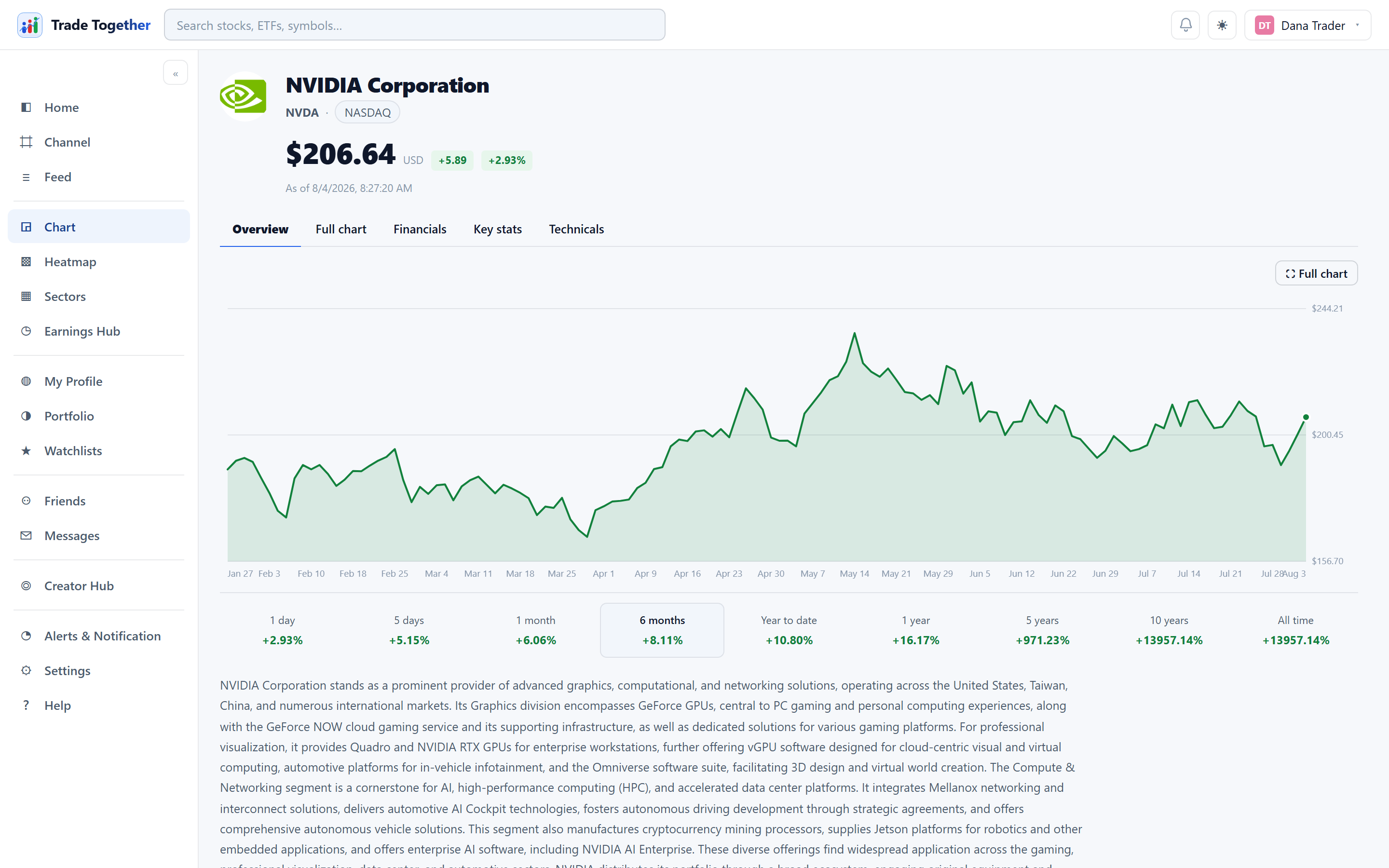
The chart page is the deepest screen in the app. It covers one company at a time and has five tabs: Overview, Full chart, Financials, Key stats and Technicals.
News. The last tab carries stories about this company from the past seven days, newest first, each with its publisher and how long ago it ran. Headlines open at the publisher in a new tab — we do not host or rewrite them. Nothing older than a week appears, so a quiet week is an empty list rather than a page of stale news. A shorter version of the same list sits at the bottom of the panel on the right.
6.1 Opening a chart
Any of these work:
- Type a ticker or a company name into the search box at the top and pick from the list.
- Click a symbol anywhere in the app — a watchlist row, a heatmap tile, a feed card, an earnings entry.
- Go to the address directly:
/#/chart/AAPL.
The header shows the company logo, its name and ticker, the exchange, and the live price with the day's change.
6.2 Overview
An area chart of the price, and underneath it a row of nine periods: 1d 5d 1m 6m YTD 1y 5y 10y All. Each one shows the return over that window and is a button — clicking it redraws the chart over that period.
Below the chart: the company description, and under that Quarterly performance — four small charts covering the last five reported quarters and the one still to come: earnings per share, revenue, net margin and free cash flow.
They are measured in different things — dollars per share, dollars and a percentage — so each gets its own chart and its own scale rather than being squeezed onto a shared one, where the largest would flatten the rest. The pale line behind each is the same quarters a year earlier, so the gap between the two lines is the year-on-year change at its real size. Hover any chart to read both years and the change between them.
6.3 Full chart
⛶ Full chart expands the chart into a working candlestick view without leaving the page. The top bar carries:
- Timeframe
- 1m, 5m, 15m and 1H are genuine intraday bars; 1D, 1W and 1M are daily and above. Intraday history is a fixed recent window — panning further back does not widen it.
- Chart type
- Candlestick, Heikin Ashi, Renko or Kagi.
- Indicators
- A multi-select — see below.
Under the chart sits the Range bar — 1W, 1M, 3M, 6M, 1Y, 5Y, 10Y. It sets how much history the chart shows, and one is always selected.
- Zooming
- Scroll to zoom in and out — no modifier key — and drag to pan across dates. If you are already looking at the newest candle, zooming out keeps it against the right edge and reveals older bars to the left, so the present never scrolls away from you. Zooming in magnifies around whatever is under the pointer. Panning past the oldest bar quietly fetches more history, so you can keep going back.
- Stretching the price scale
- The price axis down the right-hand side normally fits itself to the bars on screen. Drag it up or down to overrule that: up makes the candles taller, down flattens them. It is the fix for a quiet stock inside a wide range, which auto-fitting draws as a near-flat line, and for a choppy one that is all noise. The chart keeps following the prices either way — stretching only says how much to exaggerate what it finds, so panning somewhere else still frames the bars properly. Double-click the price axis to hand it back to auto-fit.
- Getting back
- Zooming moves the view without changing which range button is lit. Click the lit button again and the chart snaps back to exactly that range. Double-clicking the chart does the same. And once you have scrolled away from the newest bar or stretched the price scale, a small ⟲ Reset button appears over the plot — one click puts the range, the newest bar and the price scale all back.
- From the keyboard
- The chart is a tab stop, so you can reach it without a mouse — Tab until it takes the focus ring. ← and → pan through time a tenth of a screen at a time, + and − zoom, and Home puts everything back: the dates and the price scale together.
On the right sits a rail with a watchlist table (click a row to switch the chart to that symbol), the instrument's detail, and key statistics.
Drawing on the chart
The rail down the left of the full chart marks it up. Pick a tool, then click the plot: Horizontal and Vertical take one click, and Trend, Ray and Rectangle take two — one for each end. The tool releases itself once the shape is finished, so you are back to panning without having to put it down. Esc abandons a shape you have started but not finished.
The six swatches set the colour of the next drawing; each shape keeps the colour it was drawn in, so you can separate one idea from another. Drawings are stored against the price and the date, not against the screen, so they stay on their bars through any zoom, pan or change of range, and they are still there when you come back to that symbol another day.
Pencil is the odd one out: hold the mouse button down and draw freehand, and let go to finish. The line is stored against the same prices and dates as every other drawing, so it stays on its bars through any zoom.
Whatever you have just drawn stays picked up, so Delete and the rail's Delete button remove it straight away — you do not have to go back and select it first.
To change an older drawing, press Select in the rail and click it. It thickens and grows a dot at each end: drag the middle to move the whole thing, drag a dot to move just that end, and press Delete — or the rail's Delete button — to remove that one drawing. Picking a colour while something is selected recolours it rather than only setting the colour for the next one. Press Select again, or Esc, to go back to panning the chart.
Clear is not the same as Delete Delete removes the one drawing you have selected. Clear removes every drawing on that symbol at once — there is no confirmation and no undo, so treat it as the blunt instrument it is.
Some buttons in the full-chart toolbar are greyed out: split layout, replay, undo/redo, snapshot and trade. They are visible but not built. Nothing you do will make them work — they are not broken, and there is no setting that switches them on.
6.4 Indicators
Open the Indicators menu and tick as many as you want. Each one you turn on adds a small badge above the chart, so you can see at a glance what is drawn.
- Volume
- Shares traded per bar, in its own panel below the price. Green bars closed up, red closed down.
- Moving averages
- Simple averages of the last N closes. Shorter ones hug the price; longer ones smooth it into the trend. A long average often sits well away from the recent price — that is the point of it — so the price scale widens to keep the line on screen. The candles look a little flatter as a result, and the average stays visible however far in you zoom.
- MA custom
- A moving average of whatever length you choose. Turn it on, then edit the number in its badge above the chart — anything from 2 to 400 bars.
- Bollinger
- A 20-day average with bands two standard deviations either side. The bands widen when price is volatile and narrow when it is calm.
- RSI
- Relative Strength Index over 14 days, in its own panel. A 0–100 measure of how fast and how far price has moved.
- MACD
- The gap between the 12-day and 26-day exponential averages, plotted against its own 9-day average, with a histogram of the difference.
Each indicator has a ? next to it explaining what it measures and how it is conventionally read.
6.5 Financials
A table where every line — revenue, gross profit, net income, net margin, total debt, cash, free cash flow — carries a five-period bar showing its shape over time, its latest value, and its one-year change. Toggle between Annual and Quarterly at the top. Any row or card can be clicked to open it full size.
Under the table:
- Performance — price change over each trailing window, computed from daily closes.
- Seasonals — each year's price path rebased to zero on 1 January, overlaid, so recurring patterns in the calendar year are visible.
- Revenue → Net income — a waterfall showing how the period's revenue became its profit. Red bars are money spent, green is gained, blue are running subtotals. It has its own Annual/Quarterly toggle plus chips for the last four quarters or three years.
6.6 Key stats
Four grids of company facts: valuation (market cap, P/E, EPS, beta, last dividend), the latest reported earnings, per-employee figures, and details (sector, industry, CEO, headquarters, website, IPO date).
Every figure states its own basis when the basis matters — “Basic EPS (TTM)” says it is the sum of the last four reported quarters, “Last dividend per share” says it is not annualised. Hover the ? for the rest.
6.7 Technicals
Two dials, and they are not the same kind of thing:
- Technicals
- Calculated by this app from price history — a combination of the 14-day RSI, MACD and moving averages. It is arithmetic on past prices and nothing else. It does not know what the company does, what it earns, or what happened in the news this morning.
- Analyst rating
- The published consensus of the analysts covering the stock, with the number of analysts it summarises. This is a report of other people's opinions, not ours. Some symbols have no coverage at all, and the panel says so rather than showing an empty dial.
6.8 What the chart remembers
Your tab, the period, the chart type, and which indicators you had on are saved and restored the next time you open a chart. Indicator choices are remembered per symbol, so a set-up you built for one stock does not follow you onto the next one. Because it is stored on your account rather than in the browser, it follows you to another device.